
La Comercializadora de Asocebú
Prominent association of cattle breeders in Colombia
The challenge
The goal was to modernize cattle trading by building a specialized multi-vendor marketplace for La Comercializadora de Asocebu.
The platform needed to serve two distinct functions: a community marketplace where breeders could list and sell livestock, and a corporate e-commerce store for agricultural products. My challenge was to organize complex data, such as pedigree, breed, and location, into a simple, trustworthy experience that worked seamlessly on both desktop and mobile.
- Role: Lead UX/UI Designer, Researcher, & Website Developer.
- Framework: Design Thinking.
- Tools: Figma, WordPress (WooCommerce), Adobe Creative Cloud.
- Platform: Responsive Web (Desktop & Mobile).
Skills
Process & Strategy
I followed the Design Thinking framework to ensure a user-centered solution, using Trello to manage project milestones and stay aligned with the marketing team.
1. Empathize
I started by researching the specific needs of cattle breeders and buyers. My goal was to understand how to translate traditional, face-to-face livestock trading into a digital format that felt familiar, efficient, and secure for a non-technical audience.
- Competitive Audit:
I analyzed direct competitors like suganado.com and Subastar, alongside indirect leaders like Mercado Libre. The audit revealed that while specialized sites offered deep technical data, they lacked modern usability. - User Interviews:
The competitive audit provided deep industry insights, which I used to refine the questions for my initial user interviews. I then interviewed five individuals involved in the purchase and sale of cattle and agricultural products to validate our direction.
Qualitative interviews
I conducted interviews using open-ended questions to explore participants’ experiences in the cattle trade.

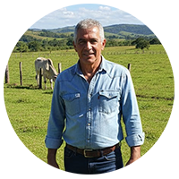
"I want to buy a bull like I buy a pair of shoes: clear price, clear location, and a 'Contact' button that actually works on my computer and phone."
- Miguel, Small-Scale Starter.

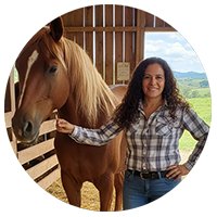
"I wish I could see all the cattle offers in the region and contact the seller directly. Having everything in one place would help me make a better choices."
- Elena, Agribusiness Manager.
"It would be great to have a single place where I can list my livestock and have buyers from the entire country. Right now, I’m limited to who I know".
- Carlos, Independent Cattle Buyer.
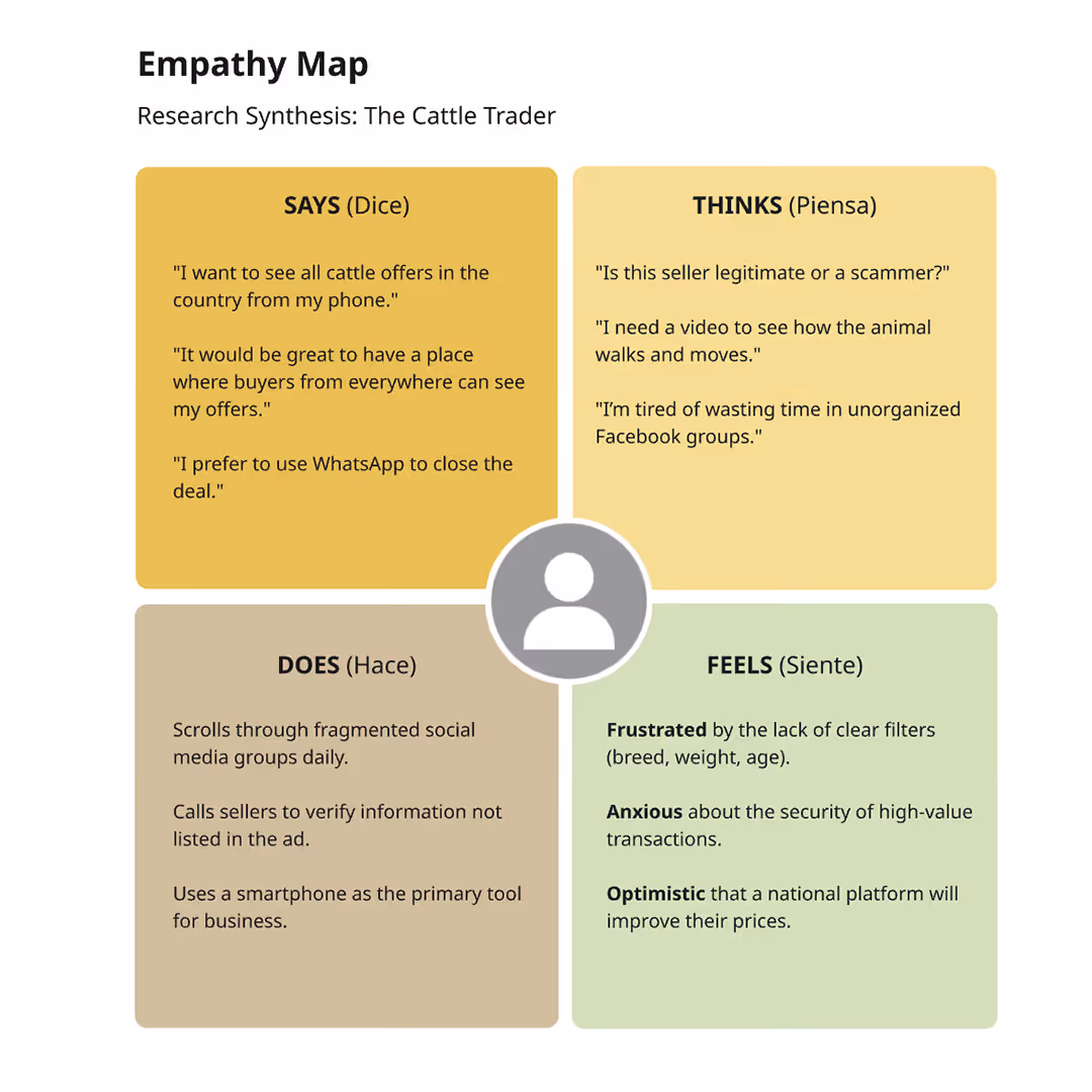
- Empathy Map:
I used this empathy map to synthesize interview data and uncover the emotional drivers behind cattle trading.
The process revealed a fear of online fraud as a major barrier to adoption. While users demand a centralized solution, the map highlights that their trust is primarily built through high-quality visual evidence (images and video) and direct personal communication. - User Persona:
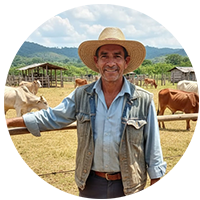
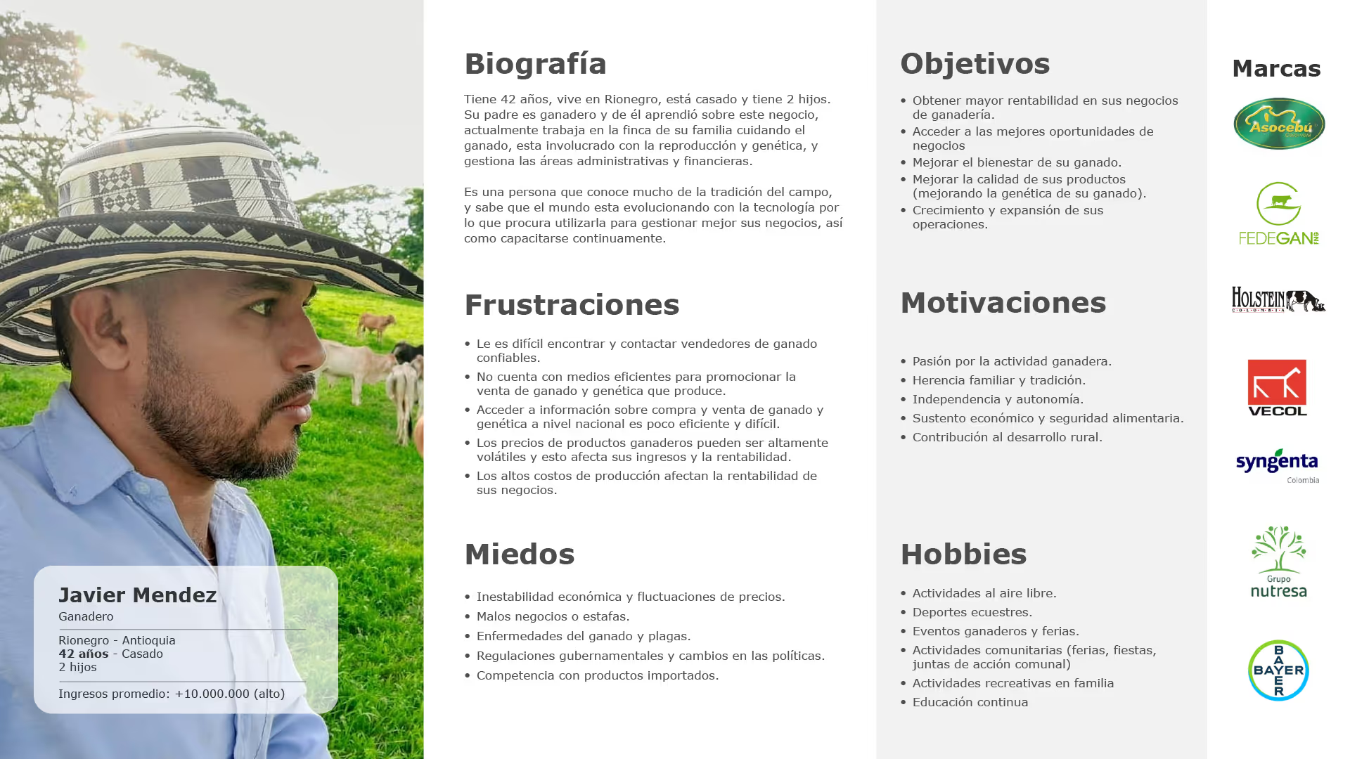
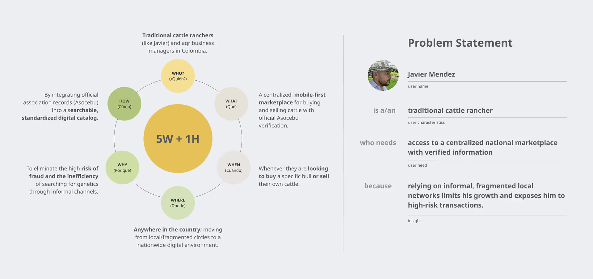
I developed Javier, a rancher representing the transition from traditional farming to digital trade. This persona highlighted a critical need for a secure, centralized platform to buy and sell cattle and agricultural products.
By targeting Javier’s primary pain points: market fragmentation and online fraud, I focused the design on building trust and expanding national reach for local producers.
- User story:
Based on the User Persona I developed this user story:
As a traditional cattle rancher, I wanted to access a centralized national marketplace from my computer or phone so that I could discover reliable business opportunities and expand my reach beyond local circles.
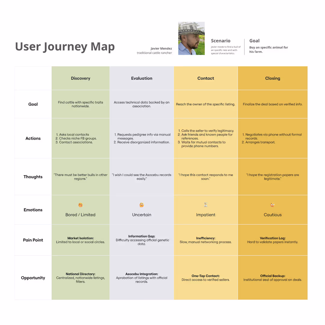
- User Journey Maps:
I charted the real-world steps for our persona, Javier Mendez, focusing on his goal of purchasing livestock for his farm. By mapping his actions, emotions, and pain points across four key stages, I was able to identify strategic opportunities to solve problems at every touchpoint.
2. Define
By synthesizing Javier’s frustrations and the institutional strengths of Asocebu, I transitioned from identifying broad problems to defining the specific functional requirements that would transform the national cattle trade.
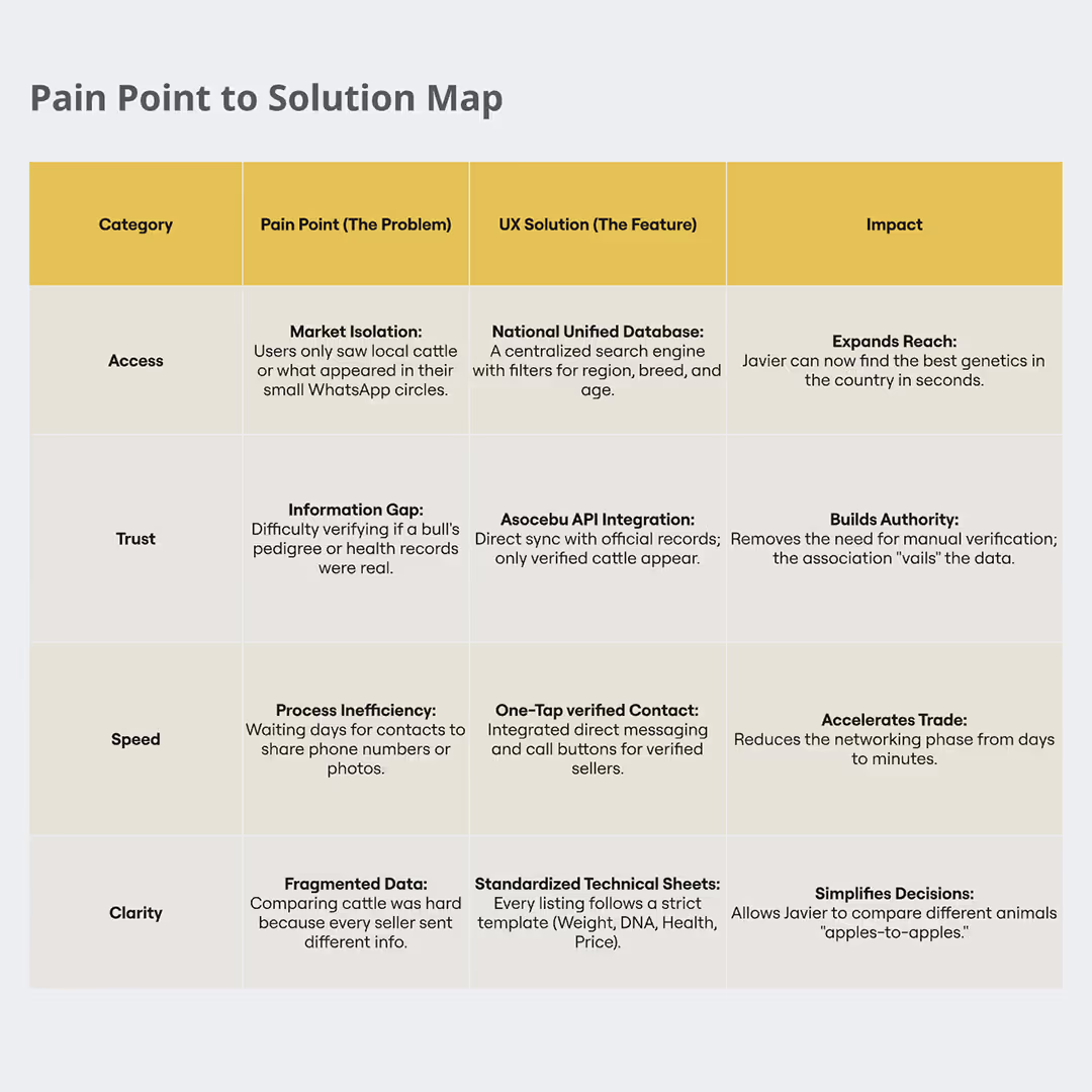
- Pain Point Synthesis:
With the research complete, I identified the primary obstacles by categorizing them into four key areas: Access, Trust, Speed, and Clarity. I mapped each major pain point to a specific feature and its projected impact. - Problem Statement:
We framed the problem to prioritize impact over output. Rather than simply building a tool, we addressed Javier’s primary obstacles: fragmented access to information and the lack of trust when purchasing livestock from unverified sellers. - Goal Statement:
Our National Marketplace will let users list, buy, and sell livestock and agricultural products using verified data and nationwide visibility, which will affect traditional ranchers and agribusiness managers across Colombia by eliminating geographical barriers and providing a high-trust, centralized environment for secure trading.
We will measure effectiveness by the speed and ease with which users locate listings and contact sellers. Additionally, we will track the adoption rate of listing plans and monitor how efficiently users can navigate the platform to find specific results.
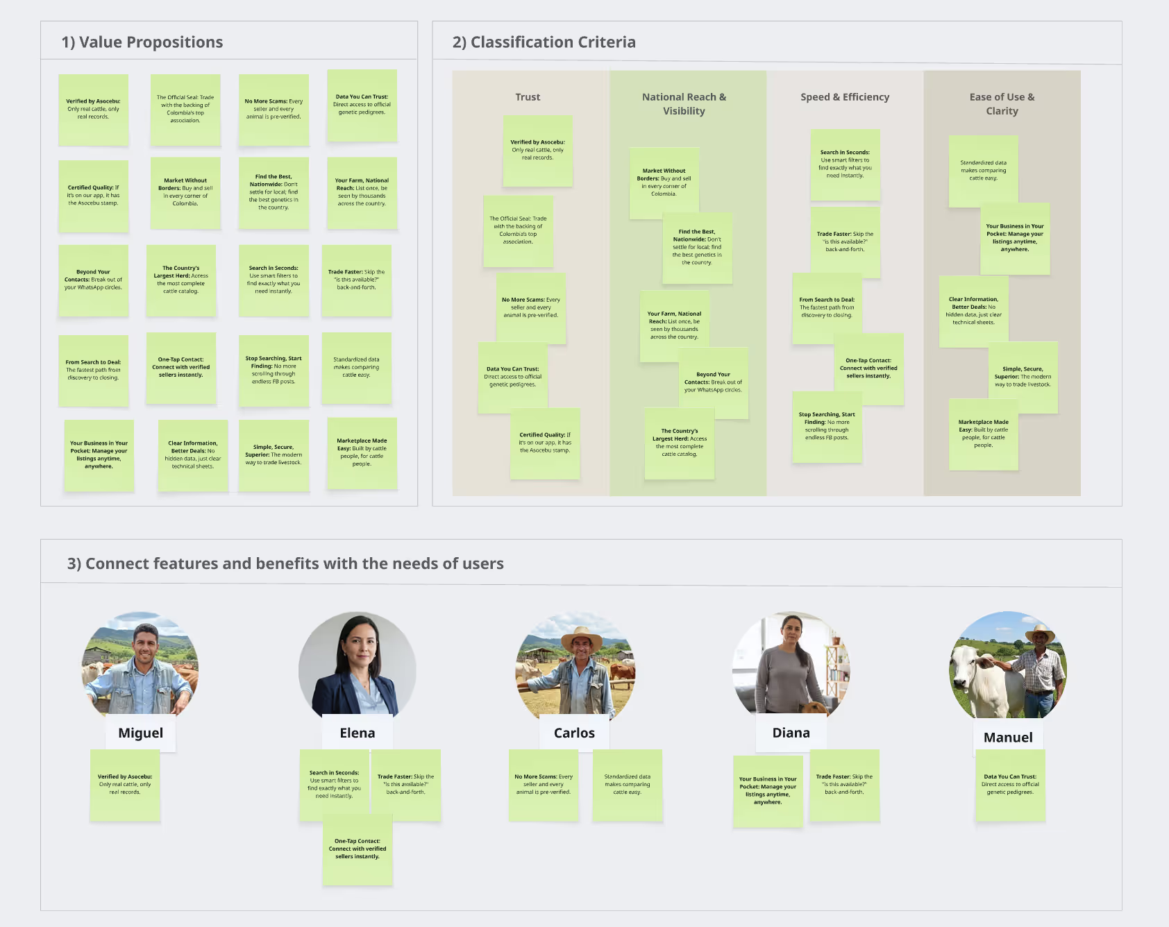
- Value Proposition Validation:
By aligning specific solutions, like Asocebu verification, directly with validated pain points, like market mistrust, I ensured the platform delivers high-value "gains" for every persona.
This mapping proves the design is a deliberate strategic tool rather than a collection of features, ensuring a perfect "Product-Market Fit" for the Colombian cattle industry.
- Hypothesis Statements:
I continued the process by developing three hypothesis statements to address the most critical user needs. One of the primary hypotheses is:
If we implement advanced search filters, such as breed, weight, age, and region, across a national database, then Javier and other ranchers will reduce their sourcing time by more than 50%, because they can bypass irrelevant local options and locate the exact genetics they need in one centralized location.
3. Ideate
The "How Might We" questions:
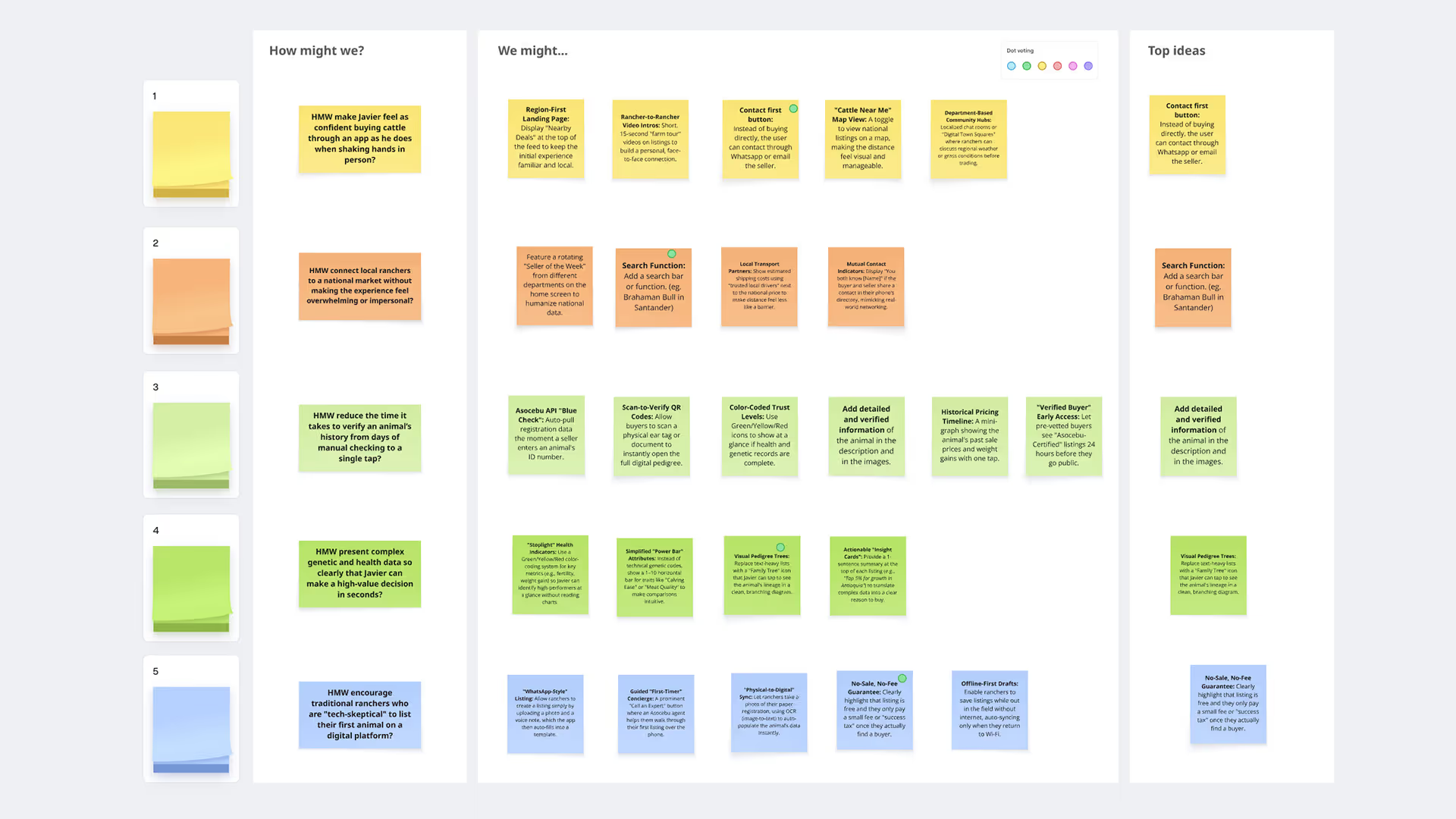
I collaborated with the Communications and Marketing teams to conduct a "How Might We" (HMW) session, reframing our core challenges into actionable design opportunities. This cross-functional approach ensured our solutions were not only user-centered but also aligned with Asocebu’s institutional brand. Examples of questions:
- HMW make Javier feel as confident buying cattle through a website as he does when shaking hands in person?
- HMW connect local ranchers to a national market without making the experience feel overwhelming or impersonal?
- HMW reduce the time it takes to verify an animal’s history to a single clic?
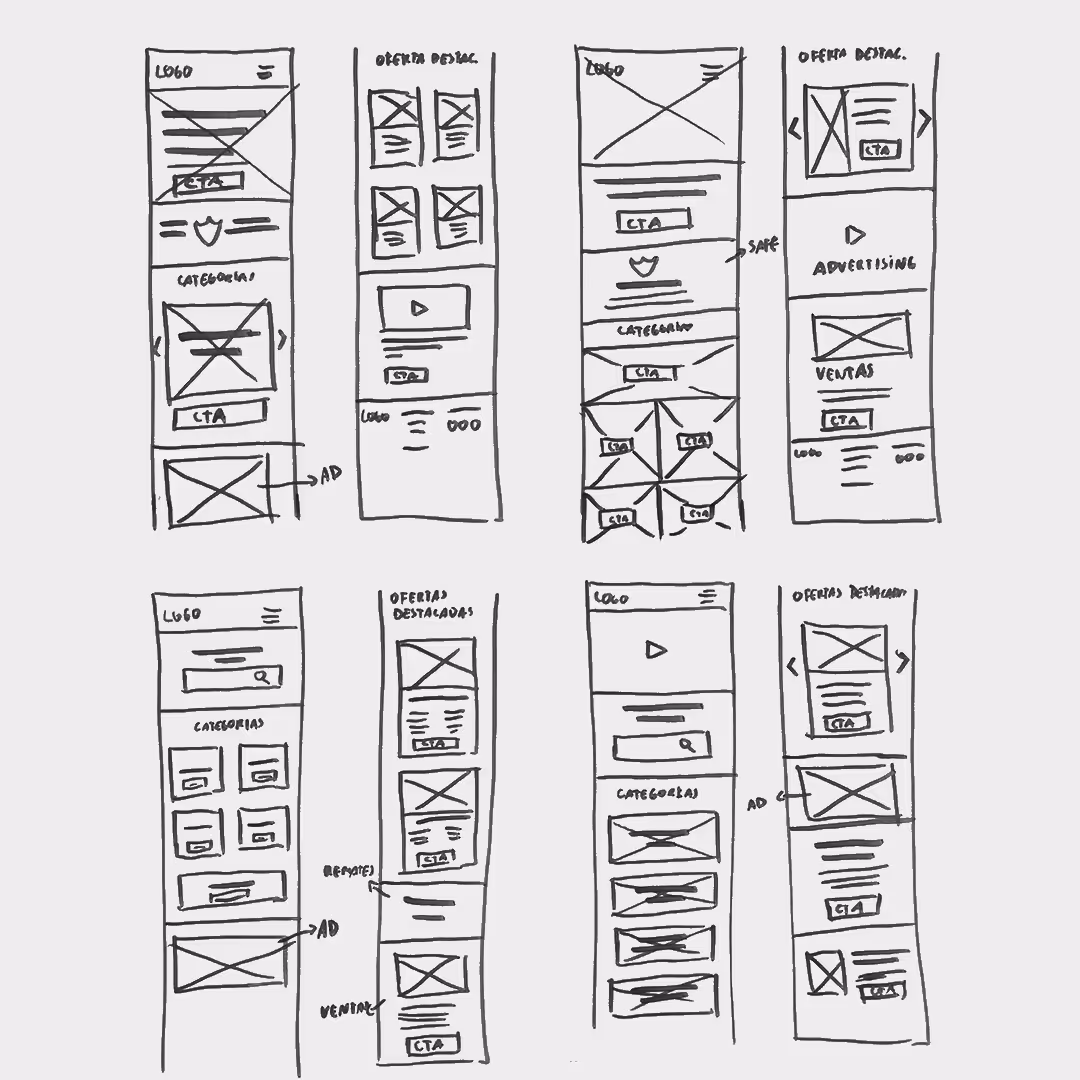
- Rapid Ideation & Brainstorming:
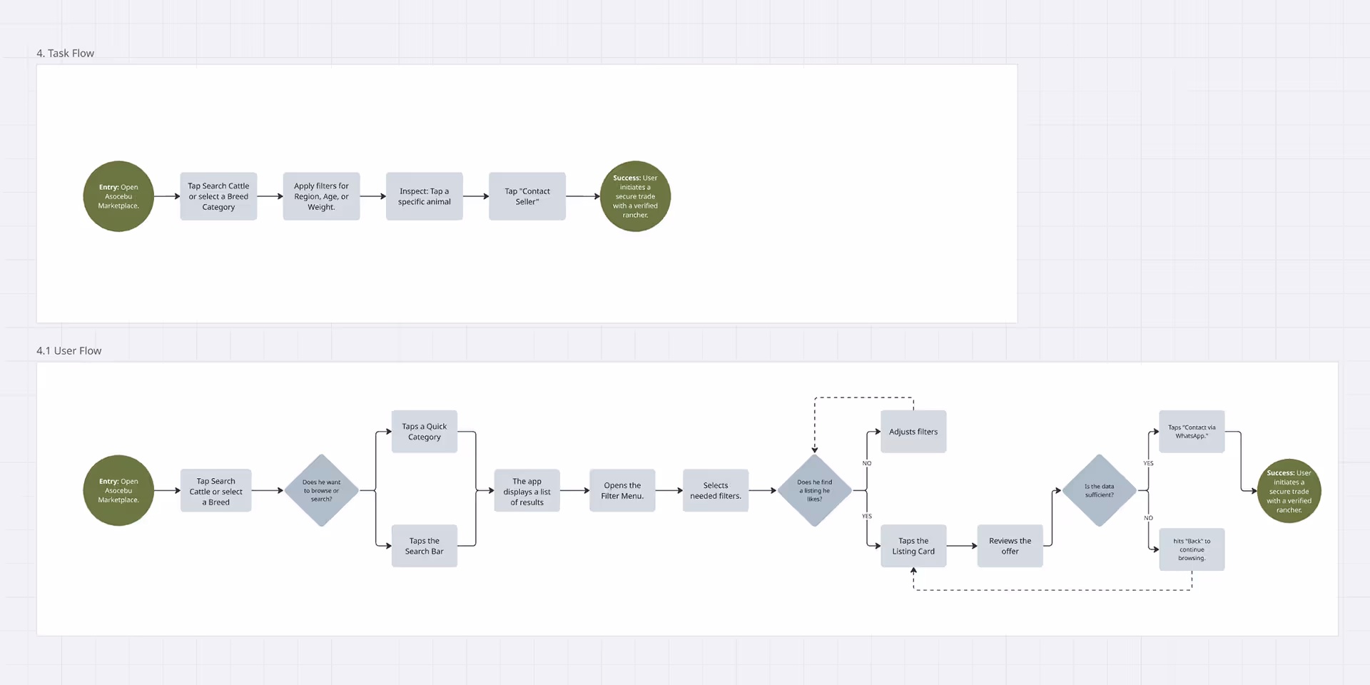
To translate strategy into layout, I conducted a Crazy Eights exercise to rapidly iterate on the platform’s core components. I focused on integrating the cattle search and breed categories with the client’s advertising requirements and a streamlined sales portal for listing plans, ensuring all key features worked in harmony. - Task & User Flows:
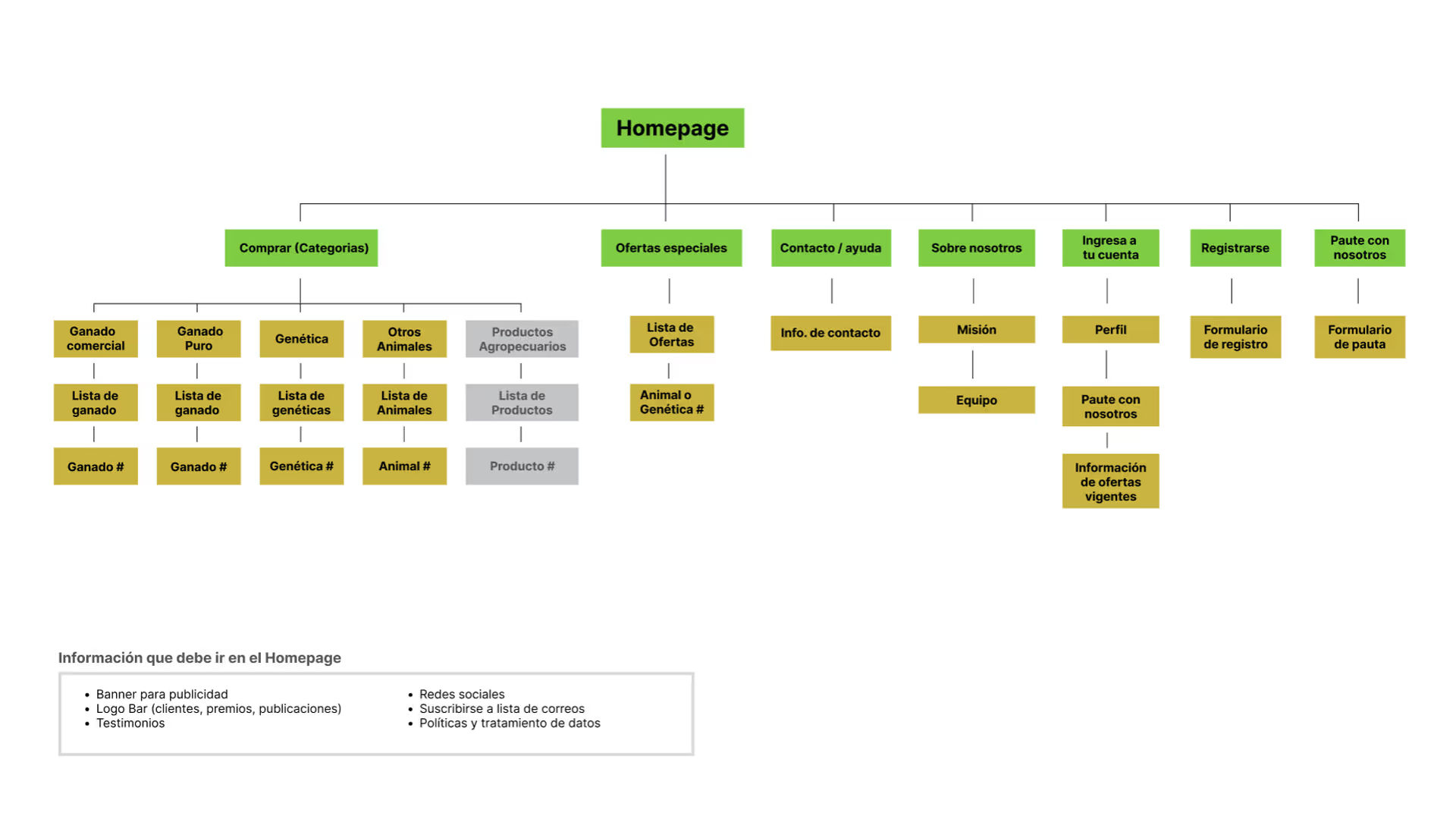
Building on those sketches, I mapped the User Flows to define a frictionless path from the initial search to the final contact. By visualizing every decision point and interaction, I was able to identify and resolve potential "dead ends" early, ensuring the navigation felt intuitive and goal-oriented. - Information Architecture (IA) & Wireframing:
With the journey validated, I established a Sitemap to solidify the platform’s navigation hierarchy. I then transitioned into digital wireframes in Figma, prioritizing content hierarchy and accessibility to ensure a functional foundation before moving into the visual design phase.
4. Prototype
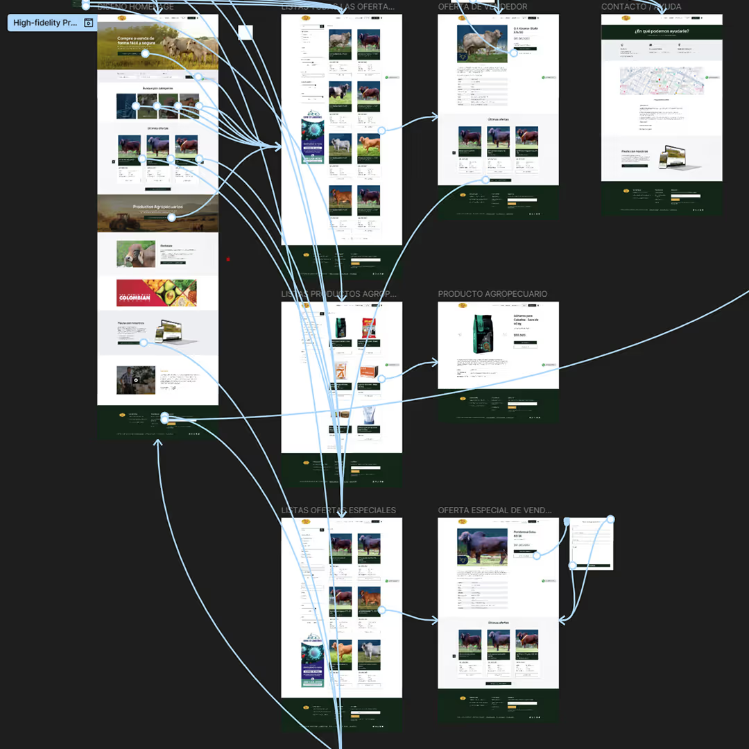
- Low-Fidelity Prototype:
I converted my digital wireframes into a Low-Fidelity Prototype in Figma to simulate the core user journey. This allowed me to test the platform’s logic and interaction flow in real-time, identifying usability gaps and validating the navigation before committing to high-fidelity visual design. - Usability Study (Lo-Fi):
To evaluate the design, I used the low-fidelity prototype and conducted a usability study with three participants. I focused on two critical paths: the efficiency of finding cattle listings and agricultural products, and the clarity of the process to contact the company to purchase a seller plan.
- Iterations: Following the usability study, I analyzed the feedback to drive meaningful iterations on the design. The testing revealed three key areas for improvement:
- Content Separation: To resolve confusion between livestock and supplies, I created a distinct section for agricultural products, ensuring a cleaner browsing experience.
- Accessible Support: Based on user requests for direct assistance, I integrated a floating WhatsApp button, providing an immediate and familiar help channel.
- Improved Discovery: To streamline navigation, I added a "Suggested Offers" section at the bottom of each listing, allowing users to explore similar options without having to return to the search results.
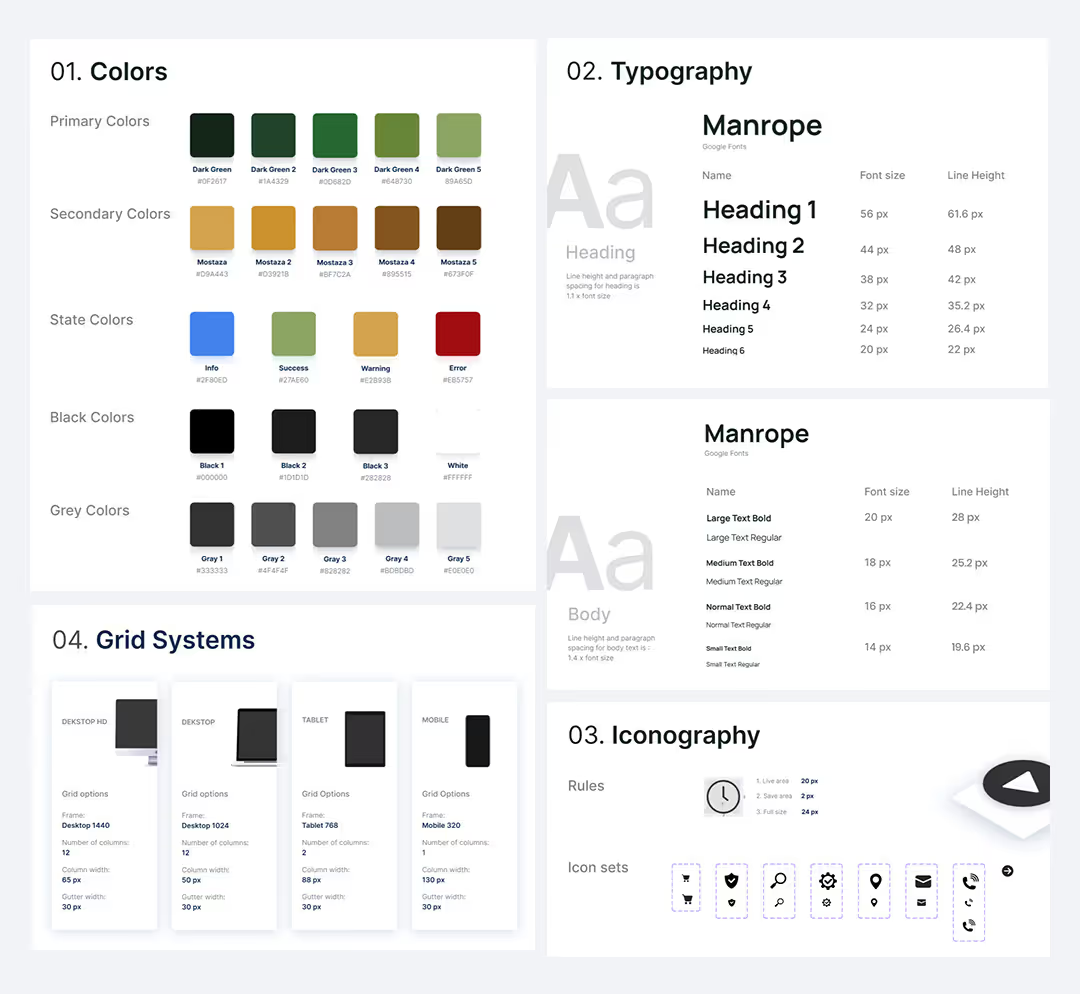
- UI Kit:
To ensure visual consistency, I developed a comprehensive UI Kit that translated the brand’s institutional identity into a digital ecosystem.
I curated a nature-inspired color palette and standardized typography to evoke immediate trust, creating a foundation that ensures any future features will feel like an inherent part of the La Comercializadora de Asocebu brand.
- Design for Accessibility & Simplicity:
Knowing users were busy professionals, I prioritized high-contrast typography and a streamlined, clutter-free interface.
To support a demographic with varying digital literacy, I utilized a clean sans-serif typeface and increased the font scale to ensure the platform remains accessible and easy to read.
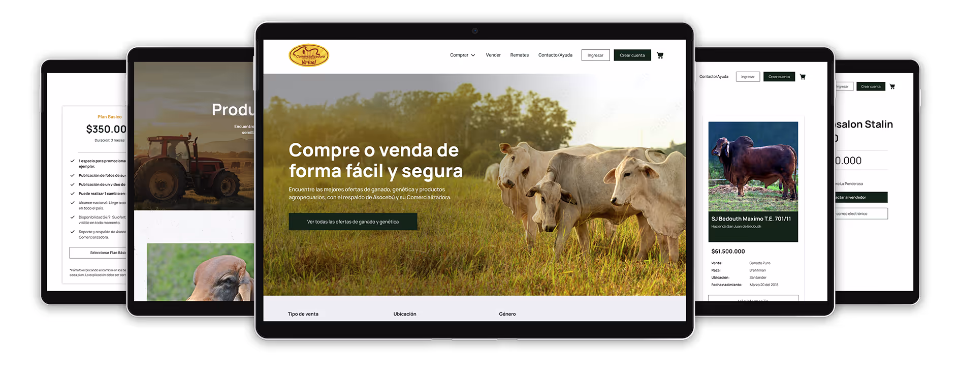
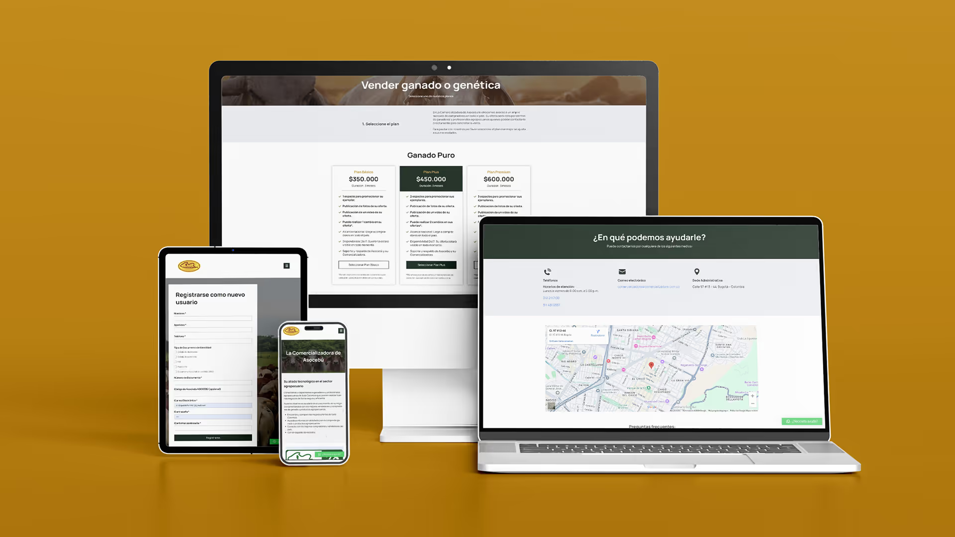
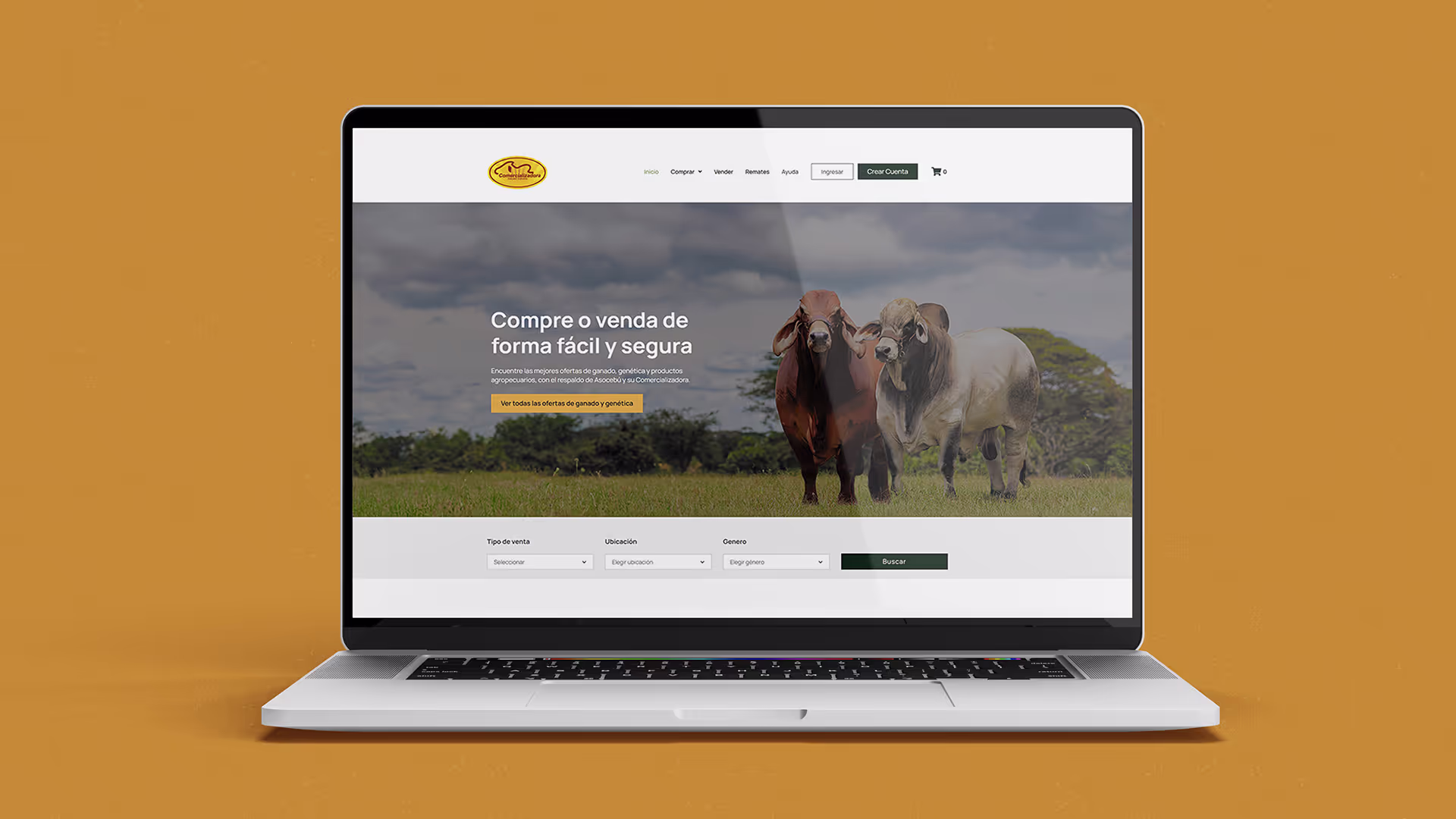
- Mockups:
Using this UI Kit as a blueprint, I developed High-Fidelity Mockups, replacing wireframes with textures, realistic imagery, and polished components.
By intentionally infusing the "vibe of nature" into the UI, I created an environment where agricultural users feel an immediate sense of familiarity and identification.
- High-Fidelity Prototype:
Finally, I transformed these static designs into a High-Fidelity Prototype by engineering complex animations and overlays in Figma.
This functional model served as the ultimate testbed, allowing for a final round of validation to ensure that critical tasks, such as sourcing cattle and navigating the seller plan checkout, were not just visually appealing, but seamless and intuitive.
4. Usability Study
This final verification ensured the interface was intuitive and the transaction paths were frictionless before moving into production.
Unmoderated usability study
I validated the platform's efficiency through remote usability studies with five Colombian participants. Using key KPIs, I confirmed the success of tasks like cattle-sourcing and plan-purchase flows.
"Seeing that floating WhatsApp button makes a big difference. In this business, being able to chat directly with someone immediately builds a lot of trust".
- Carlos, Rancher.

"Finding the listings was surprisingly fast. I usually get lost in filters on other sites, but here the path was very direct".
- Camilo, Farm Manager.
"The process to buy a seller plan was clear and easy to follow, though I was looking for a few more details on the payment methods at the end".
- Diana, Livestock Breeder.
Iterations:
Based on the high-fidelity usability study and strategic feedback from the Communications team, I implemented the following refinements during the development phase:
- Access Control: To enhance data security and lead quality, I restricted the "Contact Seller" functionality to registered users only.
- Intuitive Navigation: Recognizing that some users were less tech-savvy, I added a clear "Inicio" (Home) link to the navigation menu to supplement the logo shortcut.
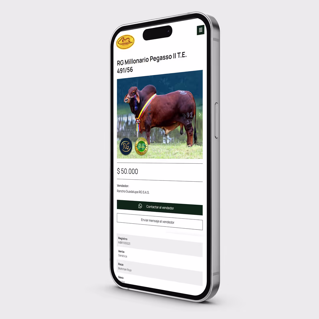
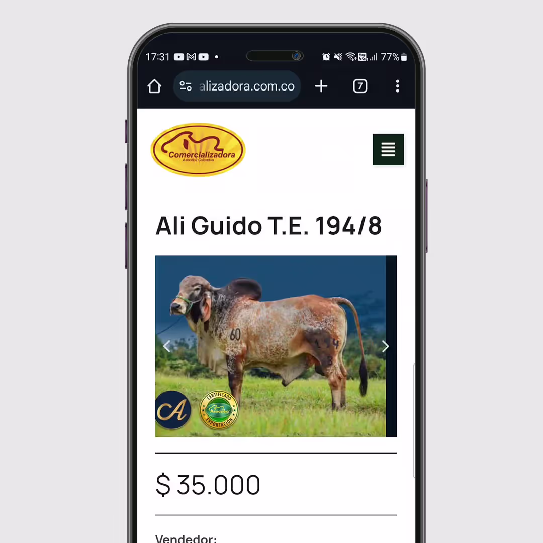
- Multimedia Integration: To meet seller demand for better product showcases, I integrated video upload capabilities for listings, providing a more dynamic and transparent view of the livestock.
- Filter Optimization: In collaboration with the Communications team, I removed "Weight" and "Birth Date" from the global filters to reduce cognitive load.
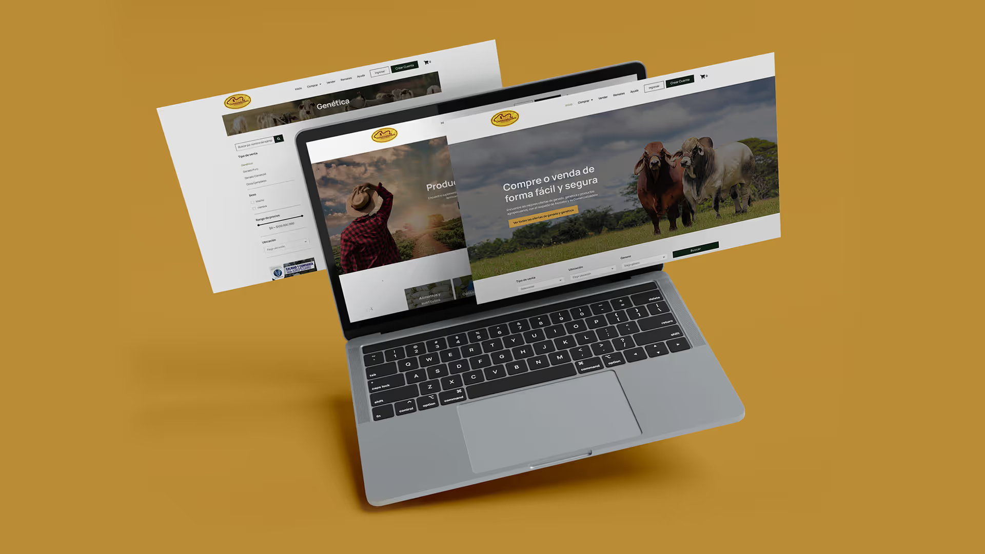
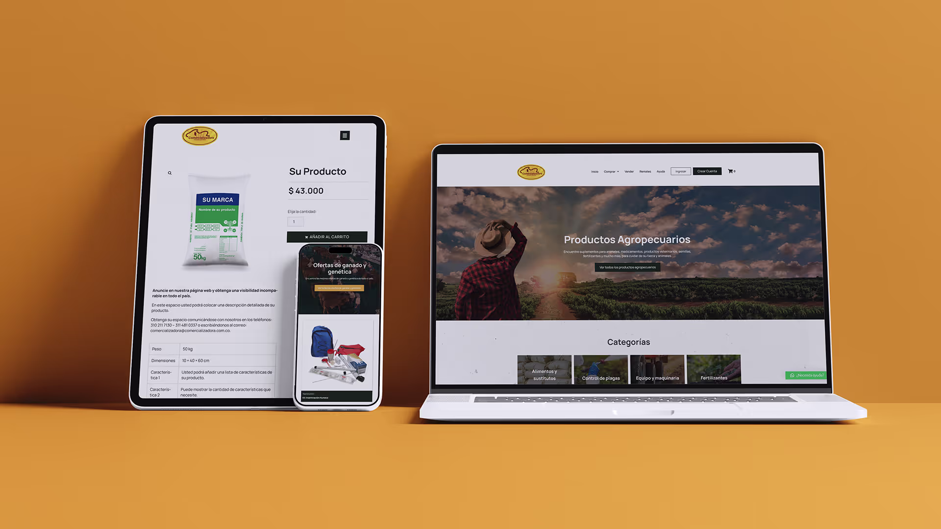
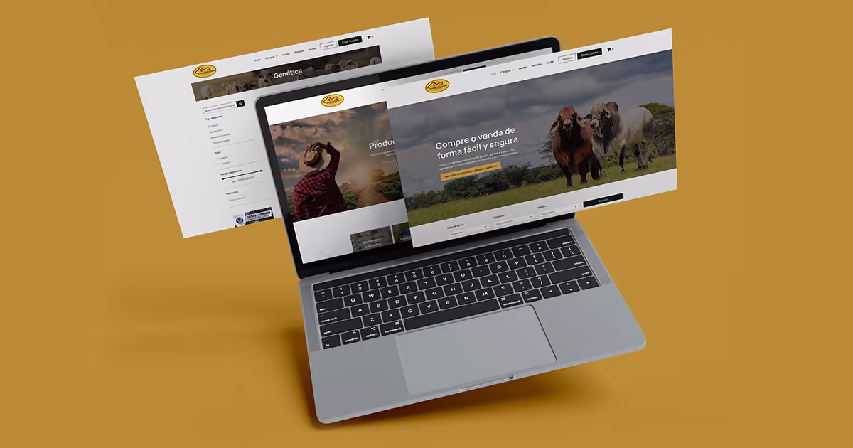
Responsive design
I adopted a desktop-first approach to prioritize this detailed transactional experience, while ensuring a fully responsive adaptation for mobile. This strategy allows users to browse cattle and products effortlessly on their phones, building the trust necessary to transition to a computer when they are ready to close a deal.
Development : From Prototype to Production
With the design validated, I transitioned to development, transforming the prototype into a fully functional multi-vendor marketplace using WordPress.
The tools:
Leveraging Elementor and the Crocoblock suite, I engineered the front-end that mirrored the high-fidelity designs while ensuring the underlying architecture was robust and scalable.
Front-end & Back-end:
Beyond the visuals, I focused on creating an automated back-end ecosystem. I developed custom intake forms that allowed the communications team to manage the marketplace effortlessly; by simply entering data and multimedia links, new listings are automatically formatted and published.
Delivery:
To ensure long-term success, I finalized the project by conducting live training sessions and producing a series of video tutorials, empowering the team to manage their new digital asset with total independence and confidence.
Results
The marketplace delivery provided a robust digital foundation, replacing manual workflows with an automated platform. Following a successful handover and client approval, the system is now being integrated into the company’s internal logistics for the official launch.
Lessons Learned:
- Digital Adoption: For traditional industries, UX must prioritize digital literacy over trends, such as adding a clear "Home" link for less tech-savvy users.
- High-Fidelity Validation: I learned that agricultural users provide far more actionable feedback when testing with realistic data and imagery rather than abstract placeholders.
- Frictionless Communication: In high-stakes markets, integrating familiar tools like WhatsApp is more effective for building rapport than standard contact forms.
Key Achievements
In-Depth UX Research.
High-Fidelity Interactive Prototype.
Responsive Multi-Vendor Platform.
Automated Listing System.
Custom Training Suite.
Check out other projects


Get in Touch
Looking for a strategic partner for your design team? I’m available for interviews and discussions regarding UX/UI and Product Strategy roles.