
Visualbit Studio
Online Education Platform
The challenge
Visualbit is an education platform providing courses and tools for visual creatives. The brand reached 200,000+ followers, but the product architecture had become a bottleneck for further growth.
I was managing eight independent products, each with its own landing page and funnel. This created a "Decision Wall" for my users. To solve this, I initiated a 5-Day Design Sprint to test a shift toward a single "All-Access Bundle".
- Role: Product Designer & Strategist (Founder).
- Framework: Google Design Sprint.
- Design and Development tools: Figma, Adobe Creative Cloud, WordPress.
- Growth & Analytics tools: Meta Ads Manager (FB/IG), Email Marketing (CRM), Google Analytics.
- Platform: Responsive Web & E-Learning.
Skills
Brand & Community Foundation
Before the Design Sprint, I built the Visualbit ecosystem to establish a "Trust Infrastructure". My focus was on using content and community to turn casual followers into a loyal audience and, eventually, students.
Brand Strategy:
I developed a brand architecture, defining the Mission, Vision, and Unique Selling Proposition (USP). I established a communication style that balanced creative authority with accessibility, positioning the brand as a "mentor" within the design community.
Visual Identity:
I designed a modern brand system centered on a custom logotype. Utilizing a minimalist sans-serif, I modified the "i" to create a unique visual anchor and brand differentiator. The palette pairs a vibrant orange to spark creative energy with a professional greyscale to establish institutional trust.
Digital Infrastructure:
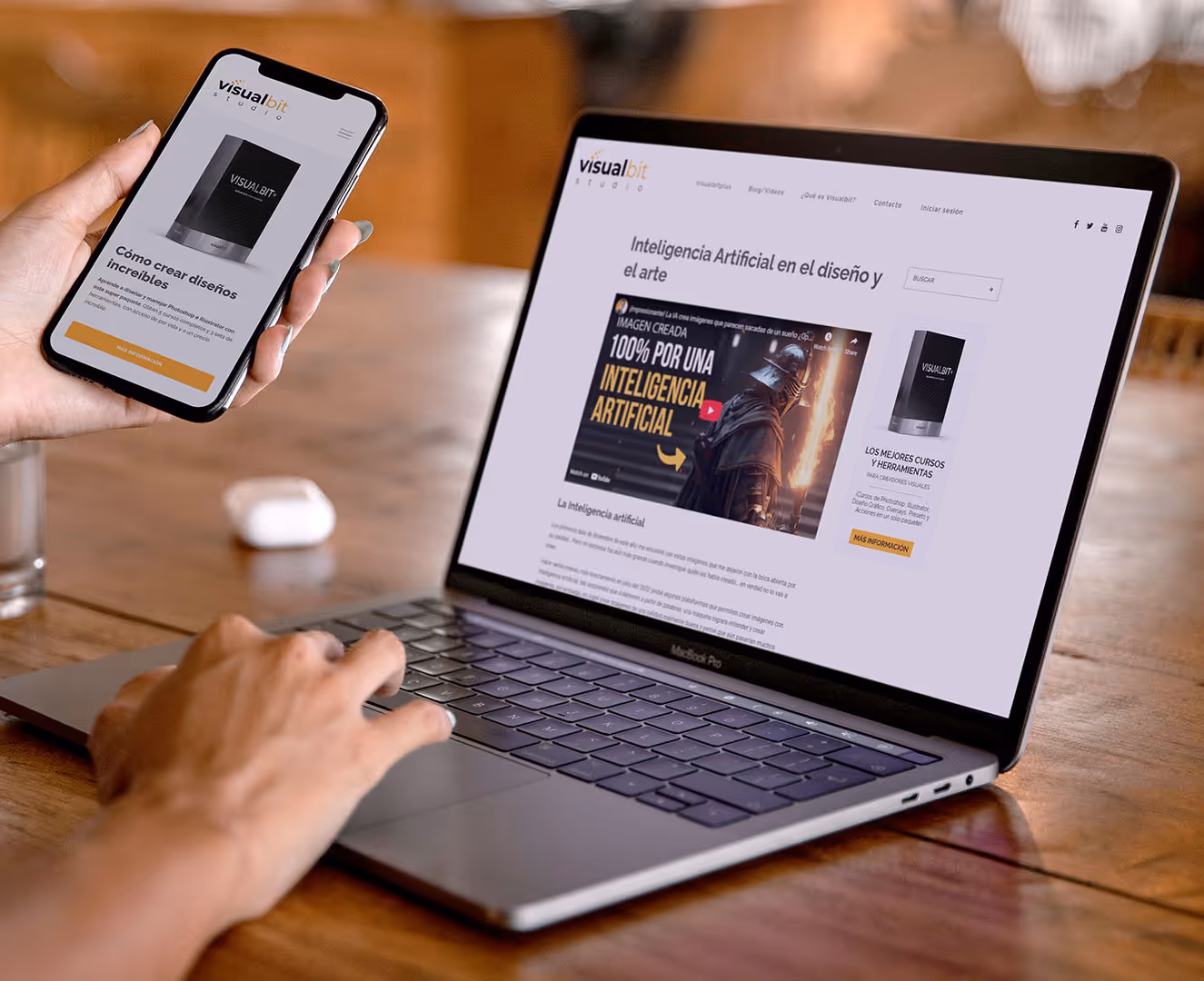
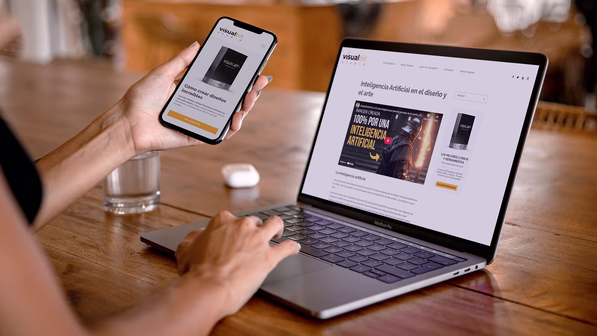
I designed and developed the Visualbit website using Figma and Wordpress, creating a centralized website for my 8 digital products (which I also developed), ranging from Photoshop/Illustrator courses to professional presets and overlays
Strategic Growth & Sales:
By combining consistent content on YouTube with targeted SEO and social media campaigns, I grew a community of over 200,000 followers.
This wasn't just a marketing win; it created a high-trust environment that allowed me to conduct user research at scale. These efforts didn't just build an audience, they successfully drove thousands of digital product sales and provided the foundation for the next stage of the business.
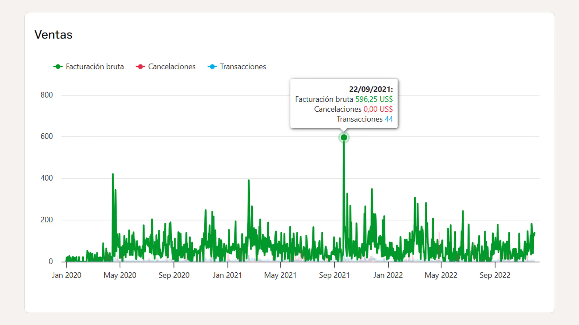
Sales from January 2020 to September 2022 (Hotmart).
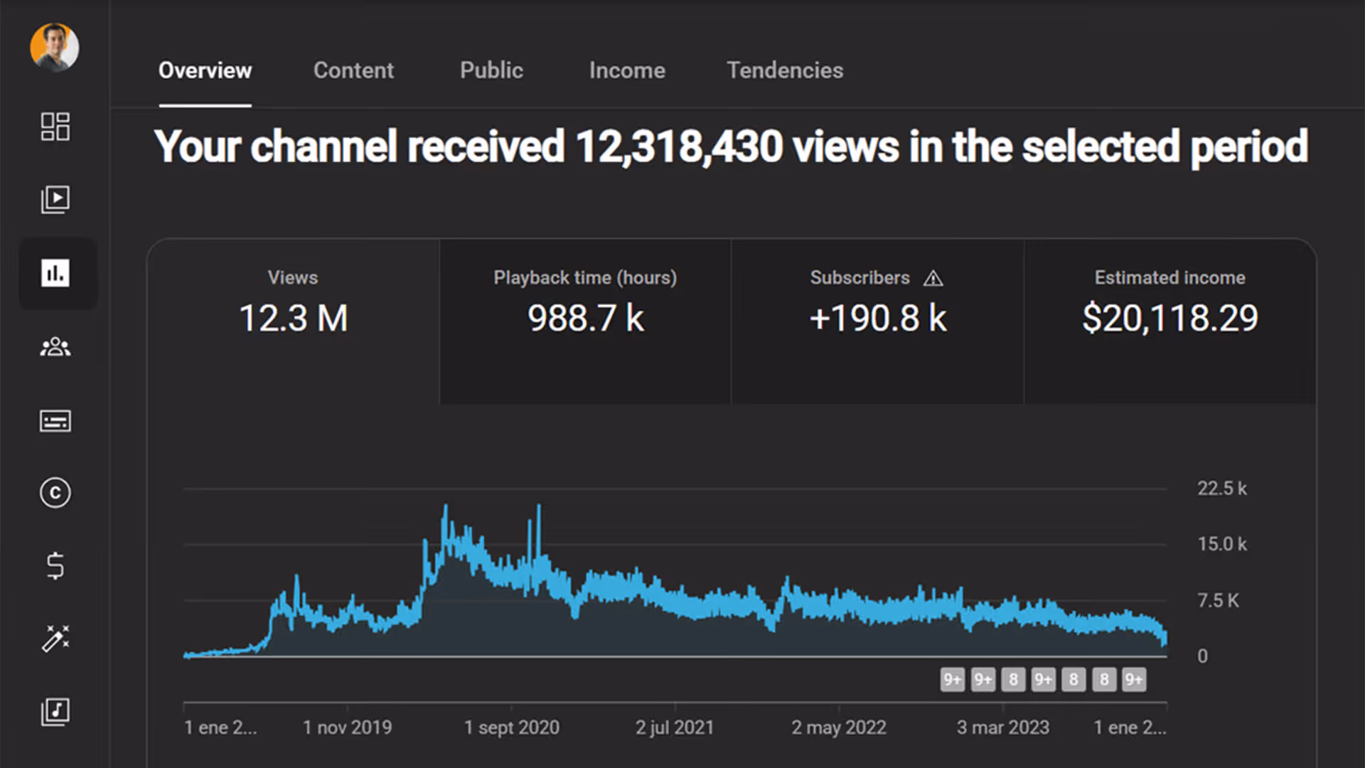
YouTube views from Januray 2019 to January 2024
The Design Sprint: A Strategic Pivot
With the ecosystem built, I ran a Google Design Sprint to simplify our chaotic product structure and find a more efficient path for both the business and my users.
Setting the Stage: The Sprint Goal
Before diving into the 5-day cycle, I defined a clear mission to keep the process focused. It was crucial to have a well defined goal.
- The Challenge:
While the brand was growing, managing eight separate product funnels became an operational problem. More importantly, our users were experiencing decision wall, having too many options was actually preventing them from making a purchase. - The Team:
A design teacher (subject matter expert), my financial manager (business/ROI), a current student (user perspective), and myself (UX designer and the "decider"). - The Sprint Goal:
Find a way to simplify the user’s decision-making process while drastically reducing the operational complexity of managing 8 different products.
Phase 1: Understand (Day 1)
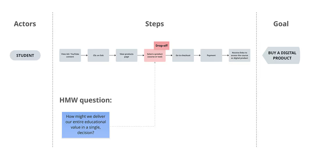
We aligned the team’s insights with quantitative data from Google and Meta Pixels. The data revealed a critical "leak" in our funnel: high-intent traffic was reaching the product page but failing to move forward.
- Lightning Talks (online):
The team shared perspectives. The design teacher focused on curriculum, the finance manager on ad waste, and the student on confusion. - Data-Driven Insights:
Because I managed the social media and student support, I entered the sprint with a deep qualitative understanding of our audience. I combined this with Pixel data from our ad campaigns to identify exactly where the marketing funnel was breaking.
The quantitative evidence was clear:
1. The Leak: We had good "Top of Funnel" traffic from Meta Ads and our Website and YouTube content, but a drop-off occurred at the product selection stage.
2. The "Decision Wall": Users were stalling when forced to compare 8 products. The cognitive load was simply too high.
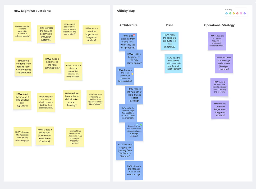
- HMW Sharing & Affinity Mapping:
We used the How Might We technique to reframe our data-driven insights into actionable challenges. We didn't jump to solutions immediately; instead, we voted on the most critical questions to ensure our upcoming sketches were solving the right problems.
Key HMWs that emerged:
"How might we deliver our entire educational value in a single, decision?".
"How might we stop students from feeling "lost" when they see all 8 products?". - User Journey Mapping:
We mapped the "Mystery" of why users dropped off after seeing the products. We identified the Product Selection Page as the critical "bottleneck."
Phase 2: Define (Day 1)
We realized that presenting eight separate options created a "Decision Wall." Our goal became to transform this complex choice into a single, frictionless path.
Picking the Target:
We decided to focus our sprint entirely on the Information Architecture of the selection page.
Success Metrics & Signals:
- Goal: Create a high-fidelity landing page prototype that clarifies our offer.
- Metric: Time on Task (How fast can they find what they need?) and Task Success Rate.
- Signal: Users express that they understand the value of the products immediately without clicking back and forth.
Phase 3: Sketch (Day 2)
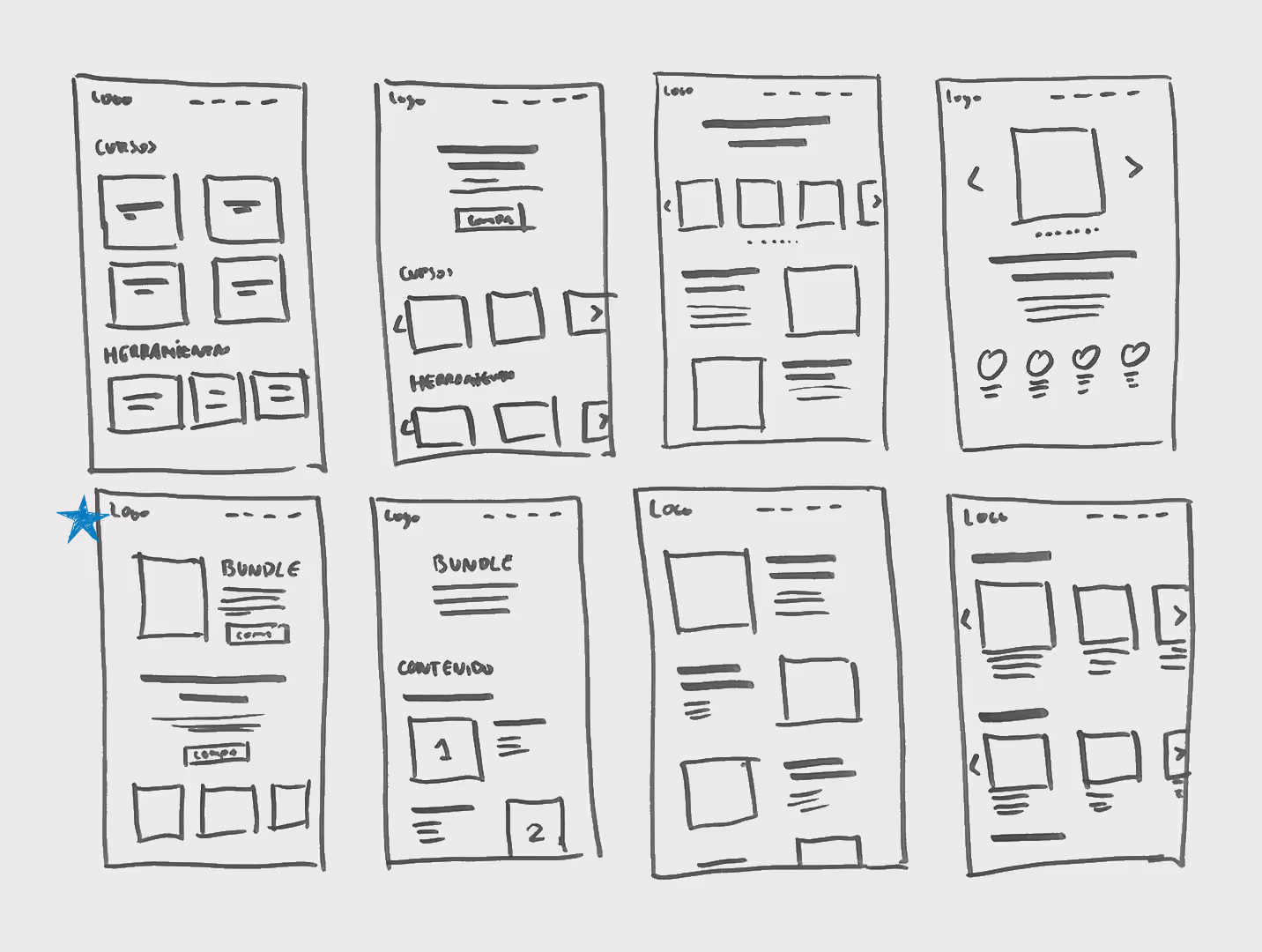
I researched how industry leaders simplify large catalogs. Using the Crazy 8s method, I iterated on eight different layouts, which led to the breakthrough concept of the "All-Access Bundle".
- Lightning Demos:
Since I led this phase, I looked at how other platforms like Adobe, Coursera, Platzi and other educational platforms present large catalogs of content or courses.
- Crazy 8s (The Discovery of the Bundle):
I sketched 8 different ways to present the courses. This is where the "Bundle" idea was born, one of the sketches explored a "One Price, All Access" model compared to a "List of 8" model.
Phase 4: Decide (Day 3)
The team voted for the Bundle solution. We realized this pivot would not only solve user confusion but also reduce eight marketing funnels into one manageable strategy.
Solution Sketch:
Drawing on my background in Digital Marketing, I developed a low-fidelity Solution Sketch for the "All-Access Bundle". I meticulously structured the visual hierarchy to follow a narrative flow: first validating the student’s pain points to build an emotional connection, followed by the bundle as the ultimate solution.
This ensured the layout wasn't just functional, but persuasive enough to drive conversion.
Phase 5: Prototype (Day 4)
I built a high-fidelity Figma prototype focusing on Information Architecture. I streamlined the value proposition to ensure users could understand the offer within seconds.
Hi-Fi Figma Prototype:
I built a high-fidelity landing page for the "Bundle" It focused on the value of the 8 products combined into one. At this point I came up with the idea for a name for this Bundle: Visualbit+.
Phase 6: Validate (Day 5)
To validate the "Bundle" hypothesis, I conducted a usability study with 5 participants representing our target audience. I wanted to see if the new architecture solved the choice paralysis or if it created new confusion.
The Tasks:
- The "Find" Task: I asked users to find a specific Photoshop course, to see if they understood that the individual products were now part of a bundle.
- The "Purchase" Task: I asked them to proceed to the checkout for the Bundle, to measure how long it took them to feel confident enough to click "Buy".
- The "Value" Interview: I asked them to share their thoughts on the clarity of the offer compared to a traditional multi-product catalog.
Key Insights:
- Instant Recognition:
Users spent zero time comparing prices. In the old model, they bounced between pages; in the prototype, they spent that time reading the curriculum because the "decision to buy" was already simplified.
- The "Bundle" Relief:
4 out of 5 testers expressed relief. One tester noted: "I always wanted to learn Photoshop and Illustrator, but I never knew which one to buy first. This just gives me everything".
- Navigation Speed:
Users successfully identified that the Photoshop course was inside the bundle within seconds, confirming the new information architecture worked.
- Humanizing the Solution:
While the prototype testing was positive, one key piece of feedback stood out: users wanted to see the "Face of the Brand" on the landing page. For that reason, as the teacher of the courses, I added my photo to the final landing page.
The Strategic Result
While the bundle solved the UX friction, it created a financial one. We realized that a high-ticket price for eight premium products risked creating a new "Price Wall".
Volume Strategy
- The Strategic Pivot: We shifted our focus from medium-ticket individual sales to a High-Volume/Low-Friction model.
- Value-Based Pricing: We positioned the "Bundle" at a price point that made the decision an "absolute yes", offering significantly more value than purchasing individual courses.
- The Result: The result was a simplified user journey and better user experience that eliminated the need for price comparison between our own products.
This strategy led to a increase in conversion rates, while simultaneously lowering customer acquisition costs (CAC) and reducing operational costs by consolidating eight marketing funnels into one.
Phase 7: Execution & Market Impact
The Design Sprint provided the blueprint, but the success relied on a unified Go-To-Market strategy that transformed how we captured and converted traffic.
Unified Funnel Strategy
By consolidating eight products into the "Visualbit+" Bundle, I was able to retire eight fragmented marketing paths in favor of a single, high-performance funnel. This drastically reduced the complexity and cost of testing new campaigns.
- The Lead Magnet & Email Marketing:
I implemented a high-value lead magnet to capture top-of-funnel interest. This triggered an automated email sequence that provided free educational content, nurtured trust, and eventually introduced the Visualbit+ Bundle as the ultimate solution for student growth.
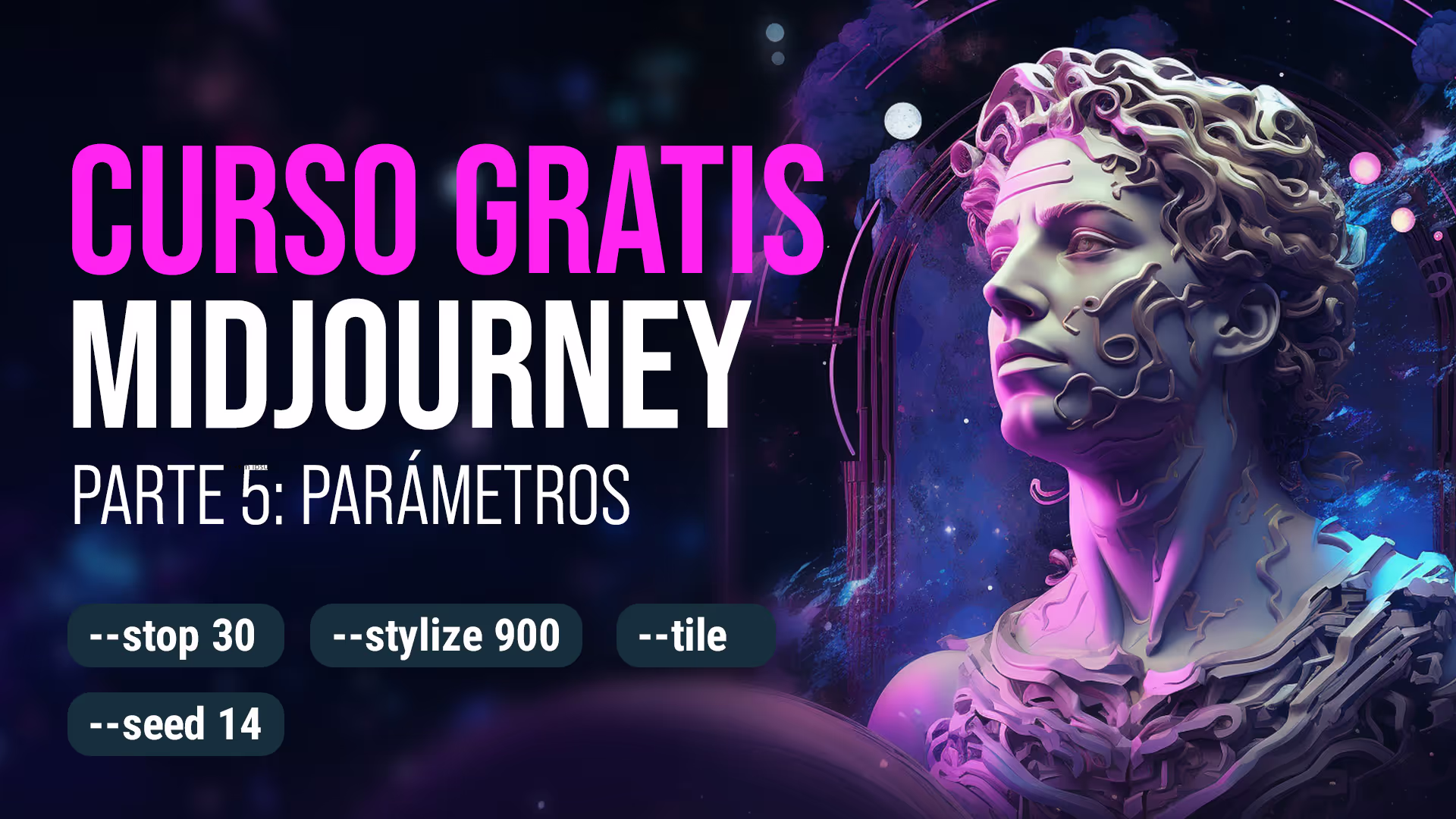
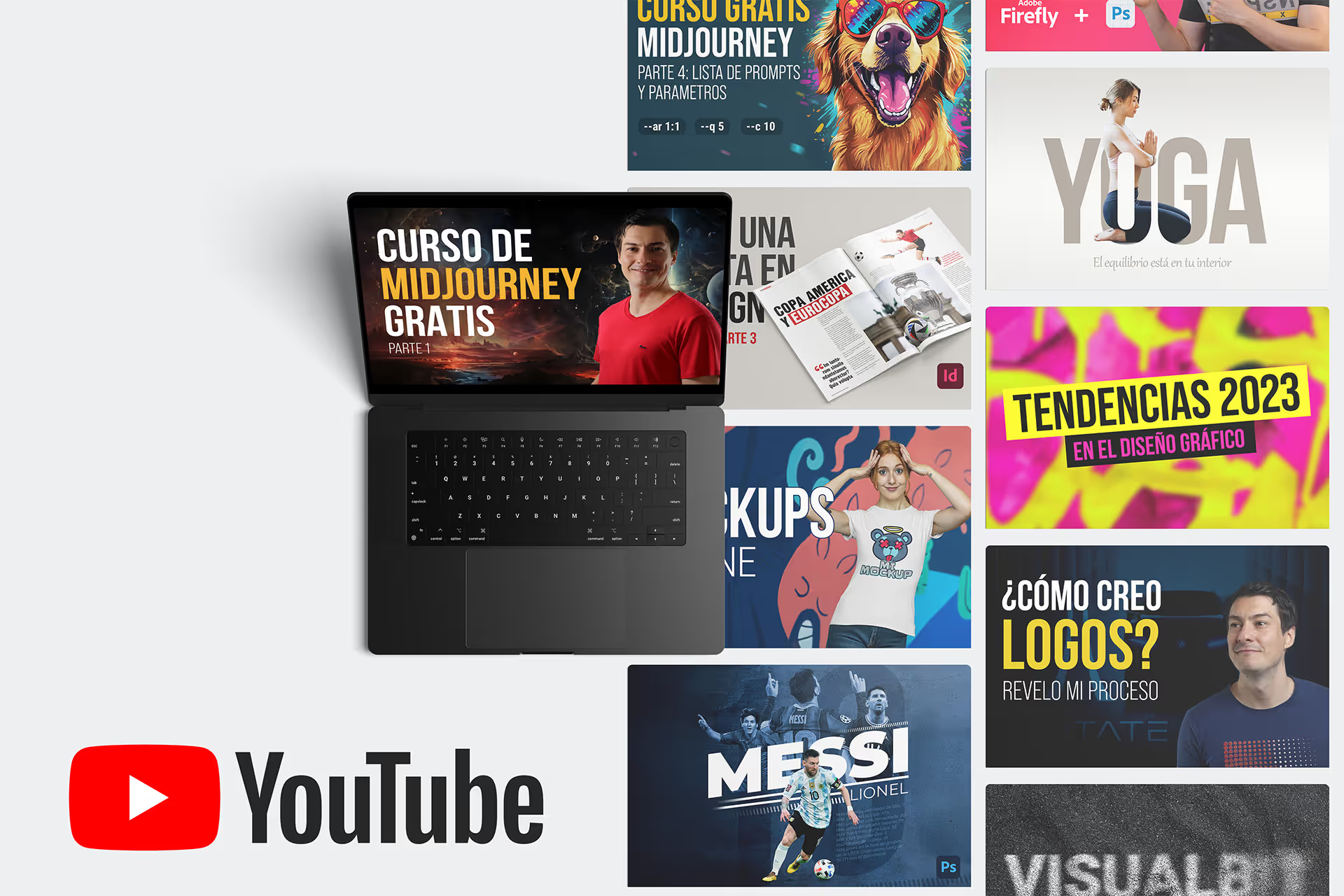
YouTube thumbnail of a free Midjourney course (see the course)
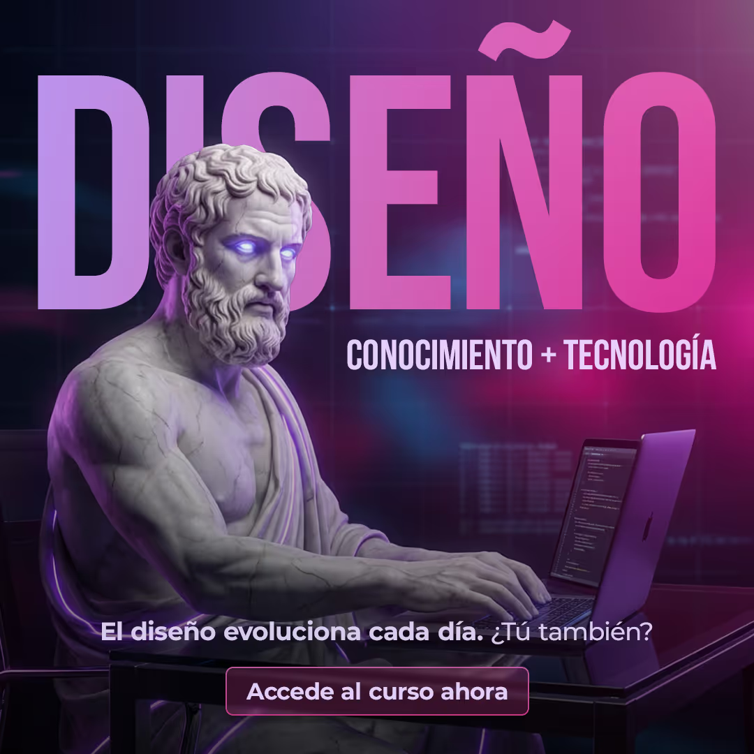
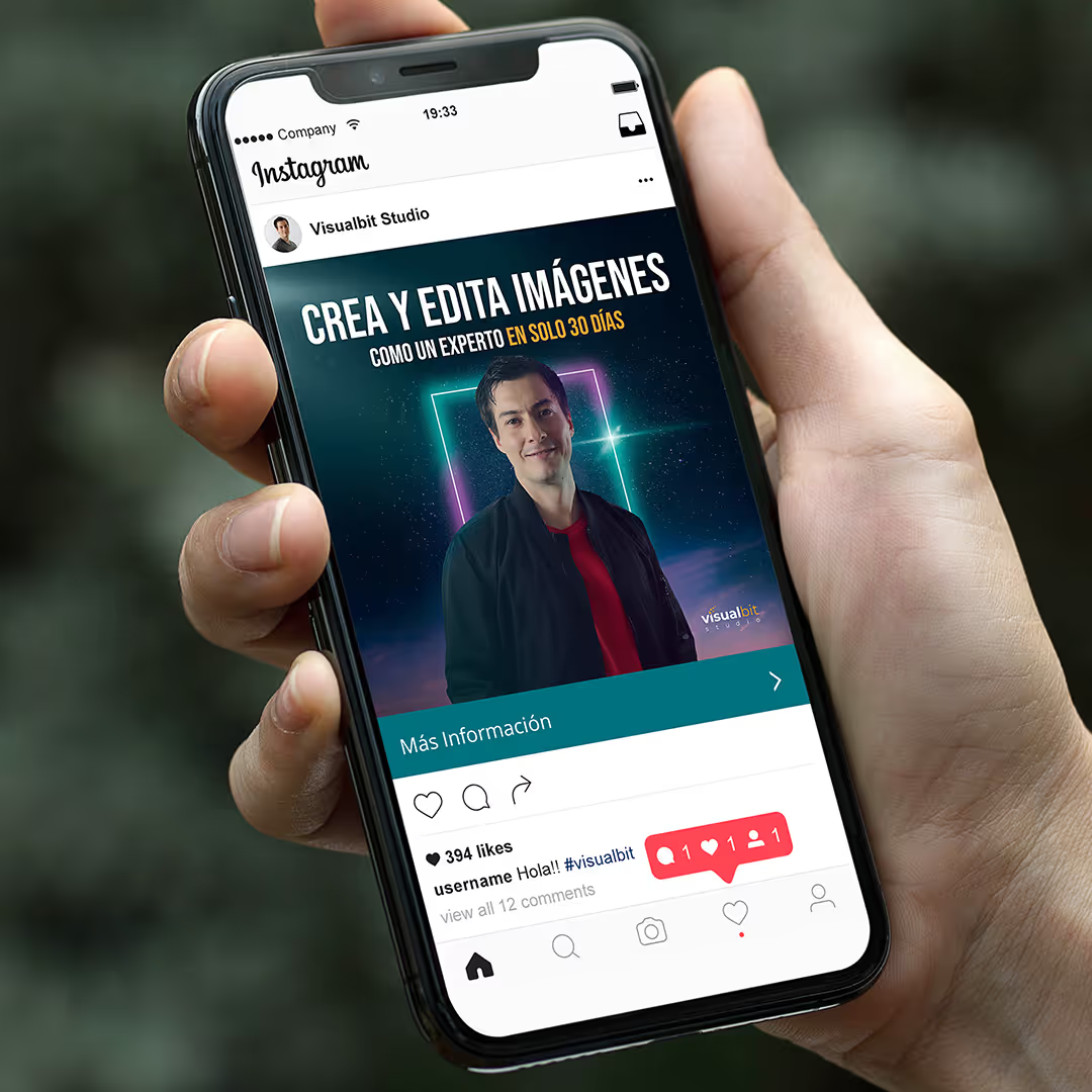
Image for a marketing campaign
- Content-Driven Acquisition
My YouTube strategy shifted from individual product promotion to "Visualbit+" bundle awareness. Every tutorial on Photoshop, Illustrator, and InDesign served as a practical demonstration of the tools within the bundle, creating a direct bridge from education to purchase.
- Paid Media & Direct Sales:
I executed direct-response campaigns with a focused budget. Managing one funnel instead of eight allowed for more aggressive A/B testing and a higher Return on Ad Spend (ROAS).
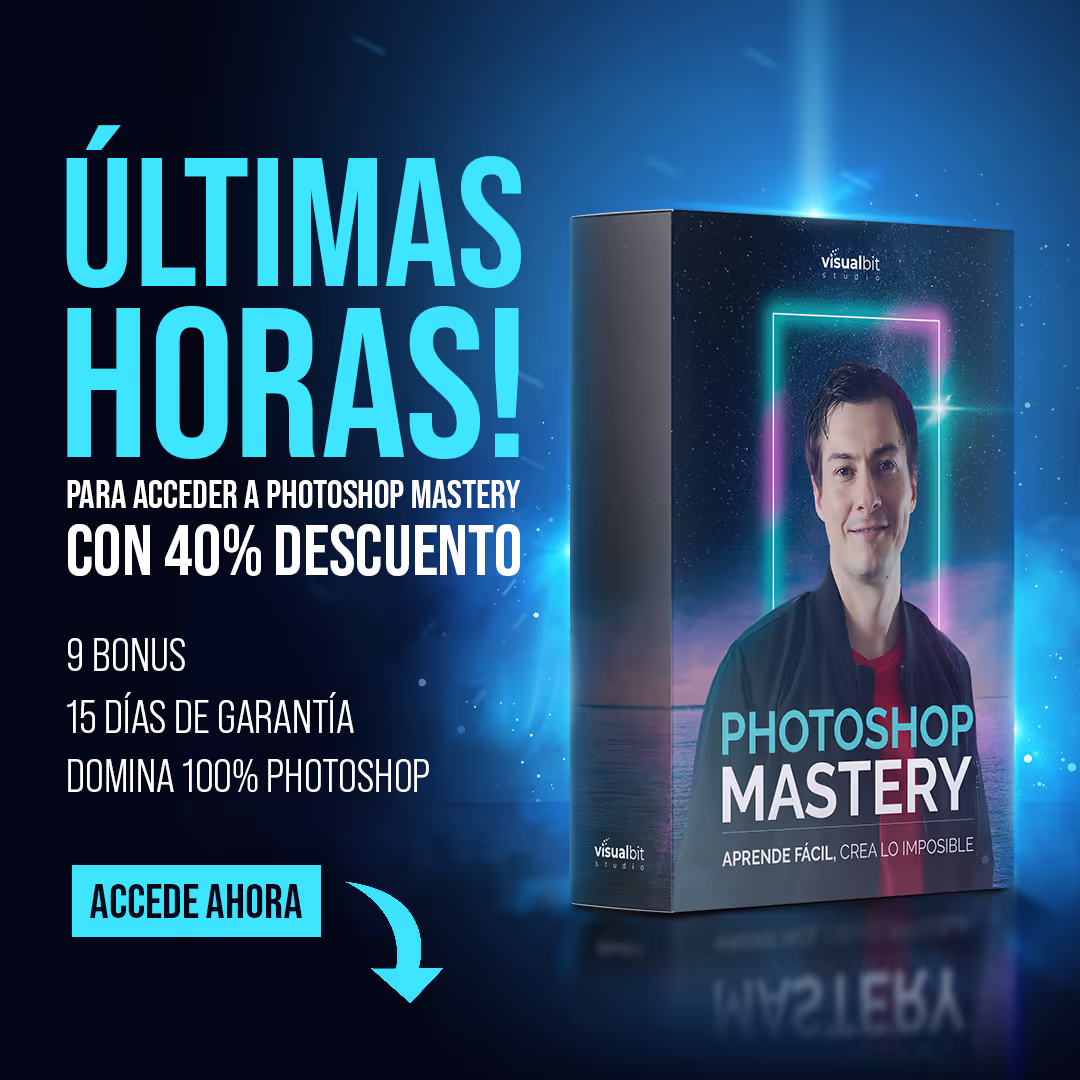
Graphic for a Paid Social Advertising

Thumbnail for a YouTube tutorial (Content Marketing)
The Results
Moving to the 'Visualbit+' bundle made things much simpler for both the users and the business. By getting rid of the confusing choice between 8 different products and focusing on one funnel, I was able to grow the project more efficiently:
- Total Sales: Since the project's inception in 2019, we have driven over 4,500 individual sales.
- Operational Efficiency: Consolidating the infrastructure lowered maintenance costs and allowed for more rapid iteration of marketing assets.
- Community Growth: The "All-Access" idea resonated with my 200,000+ followers. It took the guesswork out of which course to buy and helped everyone feel like they were part of one big, connected learning group.
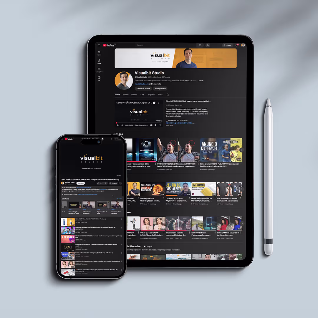
YouTube Channel with 200.000+ subscribers
Advertising for a campaign
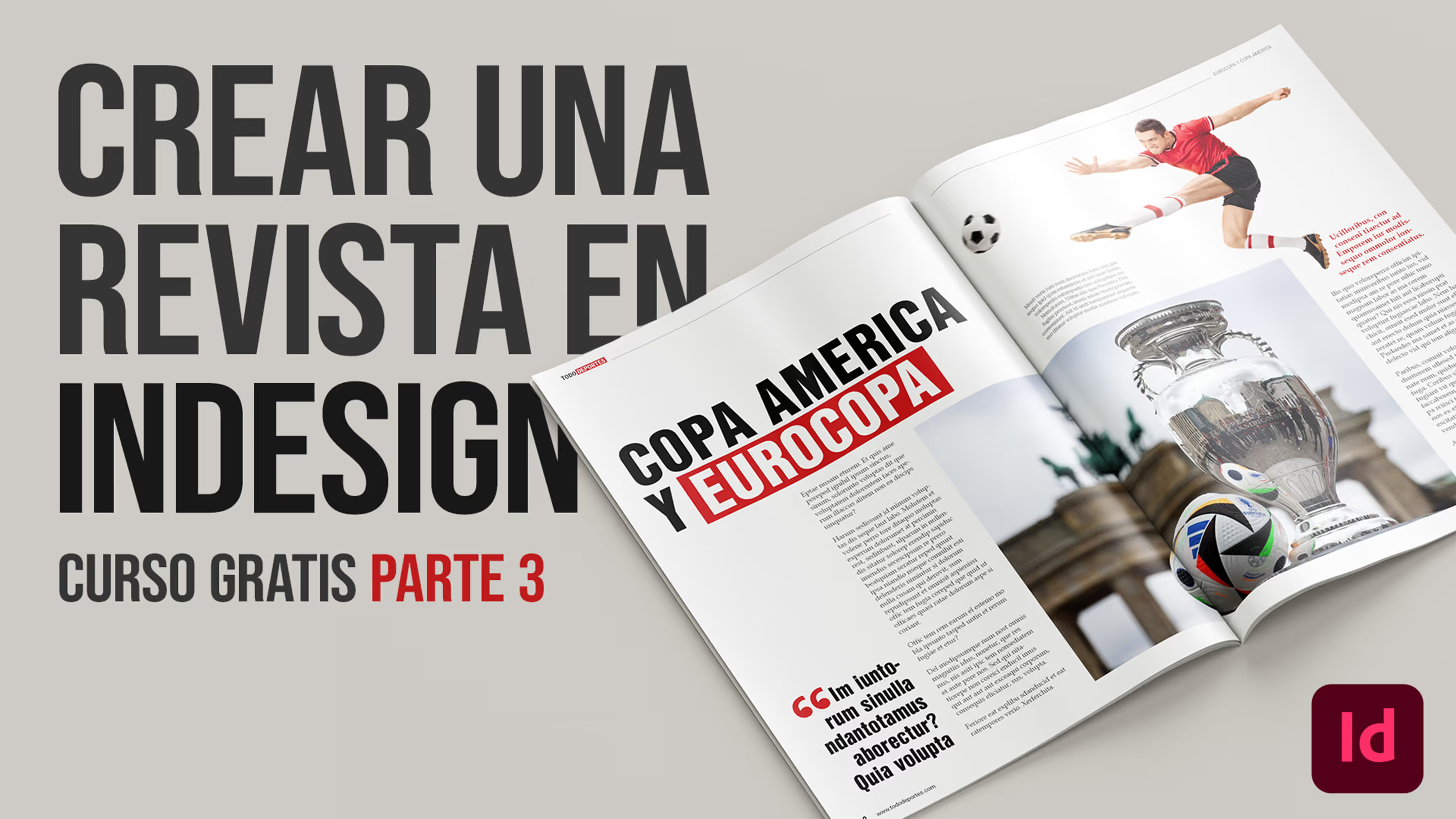
Thumbnail of free InDesign course in YouTube (watch the course)
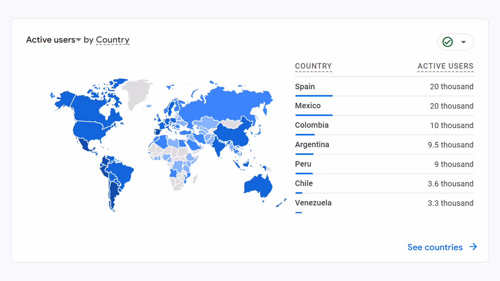
Visualbit website traffic by country from June 2023 to December 2024 (Google Analytics).

Graphic for Social Media Ad

Graphic for Social Media Ad
Key Achievements
Built a brand from scratch (200.000+ followers).
Identified a UX/Business problem (The Price/Decision Wall).
Solved it with a Sprint (The Bundle).
Executed the launch (Landingpage, Email, YouTube, Ads).
Achieved real-world scale (4,500+ sales).
Check out other projects


Get in Touch
Looking for a strategic partner for your design team? I’m available for interviews and discussions regarding UX/UI and Product Strategy roles.